When2meet mockup

When2meet

Redesigning When2meet to better highlight the service’s features and improve accessibility

Overview

I joined Davis Design Interactive’s design challenge and collaborated with another UC Davis student, Anand, on a redesign.
Over the course of 2 weeks, we worked on a product that better highlights the service’s features and improves accessibility.

Challenge

How do we improve When2meet’s accessibility issues while maintaining their ethos as a casual, no-frills app?

Project Duration

May 2021 - 2 weeks

Team

Myself

Anand D.

Approach

User Journey

To familiarize ourselves with When2meet and discover pain points, we went through the process for creating an event and adding availability to the calendar. Our audit revealed some potential issues and confusion for users at each stage.

User journey
LettuceMeet

Competitive Analysis

With LettuceMeet, all actions are multi-step. First, you mark the
calendar then continue to another screen where the user can input details.

Services such as Calendly, meanwhile, are meant for more professional use and offer a library of integrations that improve productivity in people’s workflows.

When2meet, on the other hand, combines LettuceMeet's steps on the same screen so that when creating an event, selecting dates and adding information are on the same page (and likewise for adding to a group calendar).

LettuceMeet

Ideation and Wireframing

After we identified our goal and some areas we wanted to tackle, we moved on to wireframing. Anand and I spent a week at this stage, working on generating solutions and introducing new features to make When2meet more accessible.

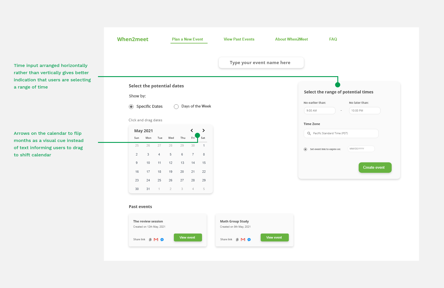
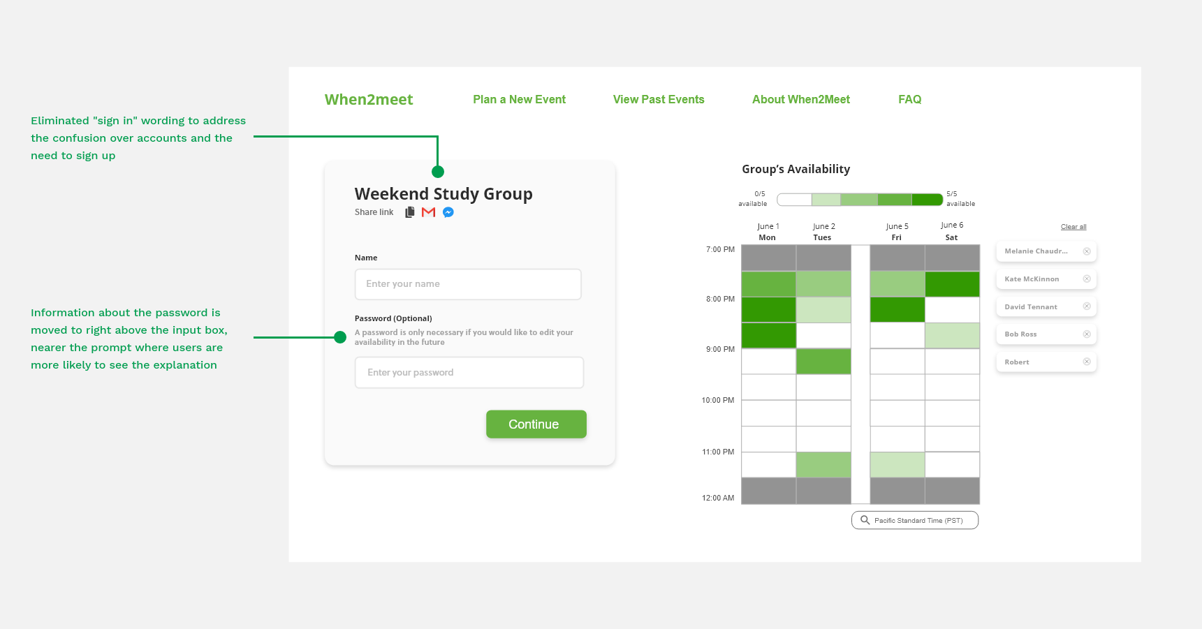
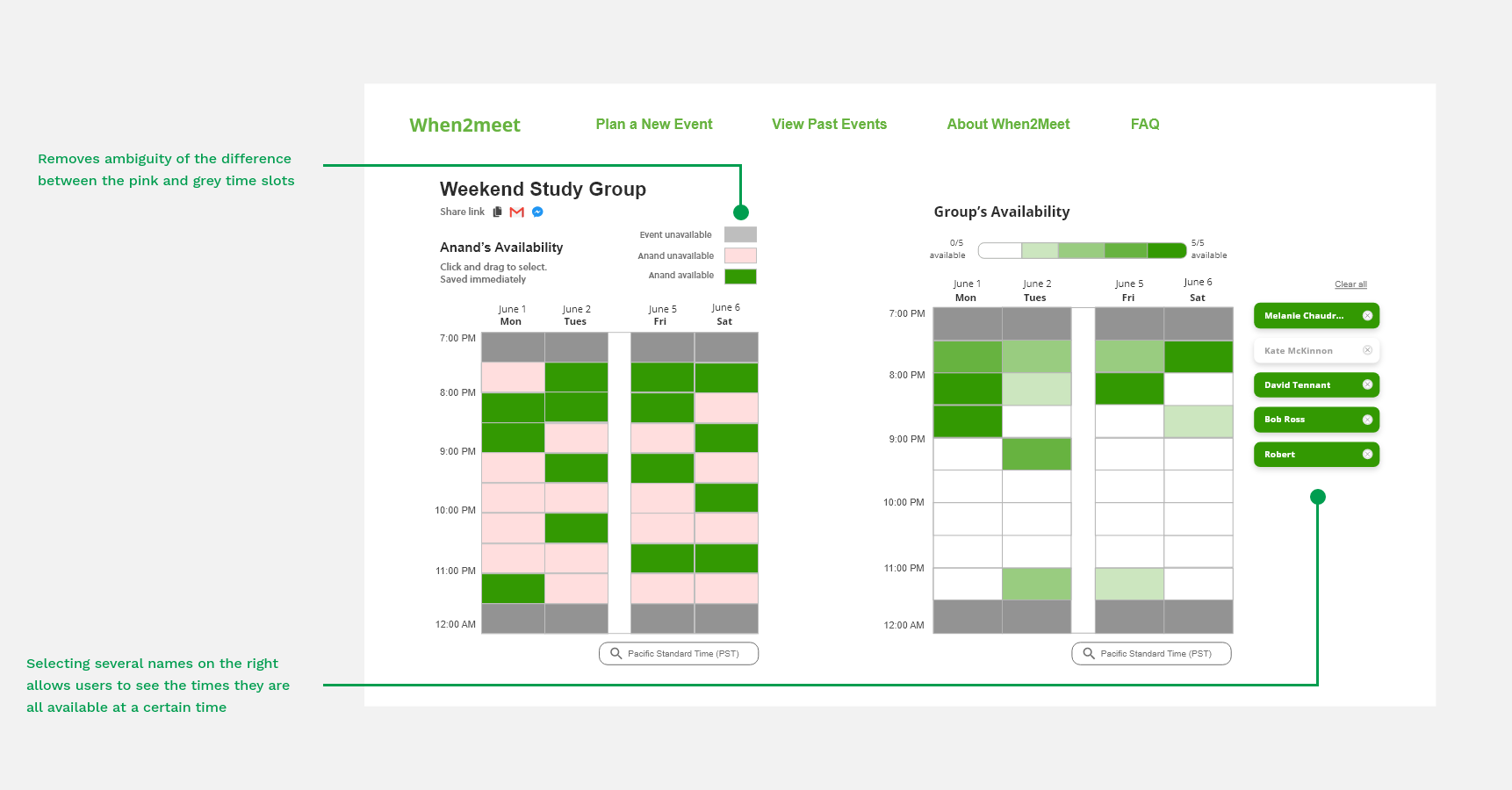
We preserved When2meet's current user flow and focused on a few key features.

Wireframing
Time zone

Time zone selector

The current time zone selector's sheer number of options coupled with the inconsistency of the listings led us to reconsider the current format.

We decided to limit the hundreds of options in the selector to only how many local time zones there are in the world. Rather than listing them as Continent/Country, Continent/Country/City, or Continent/City, we denote them here more familiarly by their local time zone abbreviation and full name (ex: PST (Pacific Standard Time)).

Our redesign additionally features a search function to make selecting the desired time zone quicker and easier.
Time zone
Number

Past events

When2meet users don’t have the ability to view the past events they've created without returning to them via a saved link stored elsewhere. This method is inefficient and unnecessarily relies on users to keep track of information.

A solution we considered was allowing people to track their past events by creating accounts, but we believed this would go against When2meet’s philosophy. Part of When2meet’s ease of use and a big draw for users is that they don’t need a user account and can immediately create an event or add to a group calendar.
Ideas
After reviewing the pros and cons of our 3 ideas, we settled on displaying past events as a section of the home page. A big tradeoff with this option is that it relies on cookies to save user information, but because a main goal of our redesign was to keep When2meet as simple as possible, we opted to continue with the 2-page format.
Number

Viewing the group calendar

Group calendar gif
A user’s individual availability calendar is covered by a list of who is available and unavailable at a certain time when they hover over that slot on the group calendar.

We came up with a few ideas about how to fix this problem, considering the placement of both calendars and where the names of available and unavailable members should go. We wanted to keep both calendars on the same page; our dilemma was determining where the names of event attendees should go. We drew upon LettuceMeet’s idea of listing out all attendees in a single column next to the group calendar.

We expanded upon this format by displaying names in buttons. The buttons turn green when the attendees are available at a certain time slot and they can also be selected, causing the group calendar to “filter” and display only those selected attendees’ availabilities. This feature is suitable for events with a large number of attendees.

Solution

SolutionSolutionSolution

Reflection

One big aspect of this project we would focus on if we had more time would be to do user testing. We were limited by the short timeframe and had to make compromises. If given the chance to work for a longer period on this redesign, we would conduct user testing and ask interviewees for feedback about the current product. For example, are other users confused about the wording of “Sign In” when they add their availability to the calendar?

We received valuable feedback when we presented our redesign, from DDI alumni who praised the features that we worked on and pointed out how it’s critical to highlight why making such changes would benefit When2meet. Their advice taught me the importance of viewing things from a business perspective and being able to articulate why design decisions matter.

This project was an awesome opportunity to dive deeper into a simple function web app. Anand and I learned how a website could initially appear simple and easy to fix but have multiple features to address, and we ended up developing a greater appreciation for all of the work that goes into making scheduling apps.